


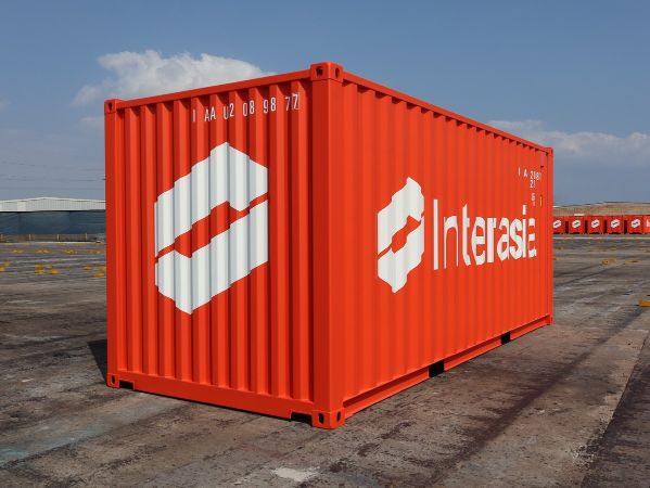
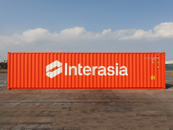
Interasia Lines, a carrier with a legacy dating back to 1967, has officially introduced its new container aesthetic: Interasia Red. This visual evolution marks a significant milestone in the company’s ongoing brand transformation, which began with a major identity renewal in 2013.
The shift to a bold, crimson-hued fleet is designed to increase brand visibility across global supply chains while symbolizing the company’s energetic approach to maritime excellence.
Connecting Heritage with Future Ambition
The transition to “Interasia Red” is more than just a cosmetic update; it represents the alignment of the company’s long-standing core values with its modern business strategy.
- Distinctive Identity: The vibrant red color ensures high visibility at crowded port terminals and on major highways, making Interasia equipment easily recognizable to partners and customers.
- Symbolism of Excellence: According to the company, the primary brand color reflects a “business mind coupled with a drive for excellence,” signaling a proactive and reliable approach to regional shipping.
- A Bridge Between Eras: The new look honors the stability of the 1967 founding while embracing the dynamic nature of the current global logistics landscape.
Global Rollout and Operational Commitment
The Interasia Red containers are now entering active service across the company’s extensive network. Shippers can expect to see these new units integrated into regular rotations throughout the Intra-Asia corridor and beyond.
The introduction of the new fleet coincides with Interasia’s continued efforts to modernize its equipment and improve service reliability. By investing in a fresh, high-visibility identity, Interasia is reinforcing its commitment to standing out in a competitive market and providing a superior service experience for its global customer base.
อัพเดตข่าวสารและบทความที่น่าสนใจในอุตสาหกรรมโลจิสติกส์ก่อนใคร ผ่าน Line Official Account @Logistics Mananger เพียงเพิ่มเราเป็นเพื่อน @Logistics Manager หรือคลิกที่นี่


 Service")