DB Schenker has opted for an updated visualization of its own brand. The transition to a new visual language of the world’s leading logistics provider starts immediately. The use of the brand logo has been adapted to align with central corporate strengths, while core elements of the external presentation in marketing formats have been fundamentally revised. It is the most extensive communicative repositioning of DB Schenker since its complete docking into the parent company Deutsche Bahn.
Jochen Thewes, CEO of DB Schenker: “Internationality, teamwork, reliability and an innovative spirit are the values which set us apart. Our customers know our capabilities and what differentiates us from the competition. With our new visual language, we will now also be able to better present these strengths. We have therefore decided to create a brand which states out more strongly from the often uniform look and feel of the logistics industry. It was time to rethink the brand and leave familiar patterns behind.”
First of all, the marketing color scheme has been revised significantly: Blue, which is widely used in the industry, is now largely abandoned. Instead, teal is used as a fresh and modern standard shade. Introducing this new type of signature color also underlines DB Schenker’s efforts and objectives for more sustainability in logistics. At the same time, elements such as the red “pulse” enable identification and recognition with the DB umbrella brand.
Rüdiger Vetter, Vice President Global Marketing of DB Schenker: “Instead of changing the logo, we have amended its environment. In this way, we remain true to the brand’s core, but can still show its development. The stronger emotionalization in the external appearance underlines the unique identity of our company, which we have communicated too little so far.”
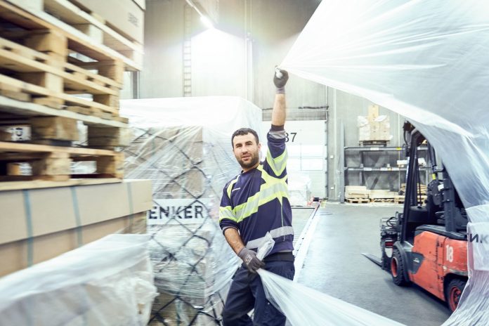
The new visual appeal is also reflected in the selection of photo motifs. The new pictures predominantly show real DB Schenker employees – authentic “heroes of logistics”. Authentic fields of work are shown in natural light. This new focus and the shift away from interchangeable images of modes of transport have already been tested in the current #OurAnswerIsYes campaign, which has met a very positive response.
Some of the new portrait pictures were taken by Munich-based photographer Thomas Straub, whose skills in visual storytelling ideally match the central idea of DB Schenker’s new brand image.
As part of the new corporate design, the use of the brand logo is also much more flexible, as the mandatory use of a white background is no longer required. This applies both to the own name “Schenker” and to the integrated “DB” logo of Deutsche Bahn AG. The optional color change of the font to white instead of black means that is can now also be used on dark backgrounds.
Since the proportion of mandatory elements in the campaign and advertising motifs has also been significantly reduced, there is more space and freedom overall to show the value positioning of the brand. This also enables the brand to be more agile in digital communication environments in the future.
The starting signal for the reorganization of the DB Schenker brand was given in 2018 when stronger global brand management for DB Schenker was initiated. The relaunch was driven forward in intensive coordination with the individual business units.
At the same time, Deutsche Bahn AG was working on a repositioning reported to the renowned Peter Schmidt Group. For DB Schenker, the design specifications for the Hamburg company were then worked out by the Mainz-based agency Conteam.
“The timing was really ideal. We worked very well with the DB marketing team. The new umbrella brand design and layout has enabled us to act more freely in our strategy, in order to position the group’s global brand more appropriately”, adds Rüdiger Vetter.
The announcement of the new brand was preceded by weeks of numerous in-house presentations, webinars, and training sessions to enable the simultaneous introduction of the new and uniform appearance in over 130 countries around the world. A further global roll-out is planned in several steps over the months ahead. A corporate claim is also in planning.
อัพเดตข่าวสารและบทความที่น่าสนใจในอุตสาหกรรมโลจิสติกส์ก่อนใคร ผ่าน Line Official Account @Logistics Mananger เพียงเพิ่มเราเป็นเพื่อน @Logistics Manager หรือคลิกที่นี่


